I'm really trying to avoid painting at all costs. I would rather run the painfully hilly IU Mini (Half) Marathon TWICE OVER before I paint my room. I think it's inevitable. I am getting to the point where I can't work around the green bedroom walls any longer. So what new color gets to grace our walls? Drumroll please.....
It's grey! I'm thinking grey with a little yellow mixed in would be "us," and after spending some time at West Elm and Ikea this week (more on that later), I was inspired by my first West Elm store purchase, which currently resides in the black-walled master bath. You know I can't resist a good zig zag pattern. I bought the one on the left, which is a gold/yellow color. This photo does it no justice!
Never, in a million years, did I expect to appreciate yellow. It's growing on me, and I can't fight it anymore...
And on a side note, grey is not just grey. Here's a screenshot from the Valspar website (gotta make sure to find the non-VOC paint):
I don't get that warm-fuzzy feeling!
where this designer's going. The mirrors behind the lamps are an interesting idea I'd like to try.

7. If there was a bathroom/bedroom I could live in, it'd be this one. That is one awesome chandelier in the bathroom! (never mind the barn door)
The barn door is also genius... I found myself referring to this photo for inspiration as I was trying to
put together the bedroom. I want that shade of grey! Heck, give me this whole room.
But wait-there's more! Have you seen my grey and yellow bedroom designed with Photoshop? See it here.
It's grey! I'm thinking grey with a little yellow mixed in would be "us," and after spending some time at West Elm and Ikea this week (more on that later), I was inspired by my first West Elm store purchase, which currently resides in the black-walled master bath. You know I can't resist a good zig zag pattern. I bought the one on the left, which is a gold/yellow color. This photo does it no justice!
 |
| [Photo: West Elm] |
Never, in a million years, did I expect to appreciate yellow. It's growing on me, and I can't fight it anymore...
And on a side note, grey is not just grey. Here's a screenshot from the Valspar website (gotta make sure to find the non-VOC paint):
Who knows the difference between "Quaking Bog" and "Steel"? Or "Garden Stone" and "Aspen Grey"?!?! Not this girl!! (Paint color selection might be hell on earth for the indecisive!)
Here are a few inspiration photos to add to the scrapbook, which include grey, yellow, or both:
1. Not too overhwelming with yellows and greens. Like the use of white to keep things light.
This room also shows that a taupe/beige rug can work reasonably well with the grey without looking boring.
It doesn't look staged while looking complete and warm. Well done!
This room also shows that a taupe/beige rug can work reasonably well with the grey without looking boring.
It doesn't look staged while looking complete and warm. Well done!
2. Possibly a little much on the neutral and whites, but a great chandelier.
This one's a little too hotel-esque and need more personality!
This one's a little too hotel-esque and need more personality!
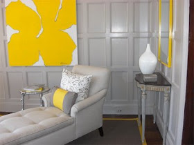
3. Living room. I'd go a little darker with the grey because the walls seem like a
dirty white next to the yellow flower canvas. It just seems like there's something missing here...I don't get that warm-fuzzy feeling!
4. Ikea. I loved this room before I even knew who designed it. (Is this even grey? Let's pretend it is.)
Picture ledges are an awesome idea, and the few darker pieces/frames with yellow
accent throw and rug seem just right. I'd have to do something about those curtains,
though... too bright! Get me some thermal curtains and we're good!
Picture ledges are an awesome idea, and the few darker pieces/frames with yellow
accent throw and rug seem just right. I'd have to do something about those curtains,
though... too bright! Get me some thermal curtains and we're good!
5. Kate Spade. A little eclectic, but clean. This shade of slate grey might be perfect!!
I also wish I could see more of the yellow ottoman/bench at the foot of the bed-
I bet it's the perfect amount of preppy.
I also wish I could see more of the yellow ottoman/bench at the foot of the bed-
I bet it's the perfect amount of preppy.
 |
| [photo: Kate Spade] |
6. (Left) Grey entryway. I never thought I'd like the way the red and grey go together... and I would bet that the bench was DIY-ed! Beautiful shade of grey for this space.
6. (Right) I think I'm in love with the wall hanging above the bed. Plus, the geometric Greek key pattern had
me hooked at first sight. I'm not committed enough to buy chairs or lamps that are yellow yellow, but I likewhere this designer's going. The mirrors behind the lamps are an interesting idea I'd like to try.
 |
| [Photo: Decor Pad] |

7. If there was a bathroom/bedroom I could live in, it'd be this one. That is one awesome chandelier in the bathroom! (never mind the barn door)
The barn door is also genius... I found myself referring to this photo for inspiration as I was trying to
put together the bedroom. I want that shade of grey! Heck, give me this whole room.
 |
| [Photo: Decor Pad] |
But wait-there's more! Have you seen my grey and yellow bedroom designed with Photoshop? See it here.


No comments:
Post a Comment