
New revelation: blue doesn't work in the front room because the pain color is a warm beige with red tints. Even adding a red accent pillow looks so much better than the cool colors I was trying to force before. Check it out:

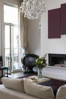
I've never been a big fan of just red, so a compromise might be in order. Here are a few inspiration rooms featuring purple pops:

Mixing shades of purple...
I love this artwork! It's so amazingly simple! (DIY anyone?)


Purple it is! Time to get experimenting...

I've never been a big fan of just red, so a compromise might be in order. Here are a few inspiration rooms featuring purple pops:

Mixing shades of purple...
 |
| Photo: Aphrochic |


Yeah, it's a nursery. But the pale purple and clean lines look so classy:

Purple it is! Time to get experimenting...
Experimenting with a nursery? Or just purple? Hee hee.
ReplyDeleteHi Steph-
ReplyDeleteYour house is so lovely, I'm sure you'll have no trouble making it your own with various design touches. I love the idea of purple - it is indeed a great compromise between cool and warm colors and always feels very rich and warm (I guess there's a reason why it's considered a royal color). I use it a lot both in saturated jewel tones and really muted pastel/grayed out tones.
Thanks for submitting your living room to Mochi Home. I'm just getting to your makeover now, so I'll definitely try one option with purple. I'll also give you some non-purple ideas too. Let me know if there is anything specific you'd like to see in the place.
It's been fun checking out your house and DIY projects on this blog! Let's see if I can come up with some ideas that reflect your style...
Carly (Mochi Home)